

bCloud AI

⚡ Mobile Commerce · Guide

Mobile Ecommerce Search: Design Search That Converts on Small Screens
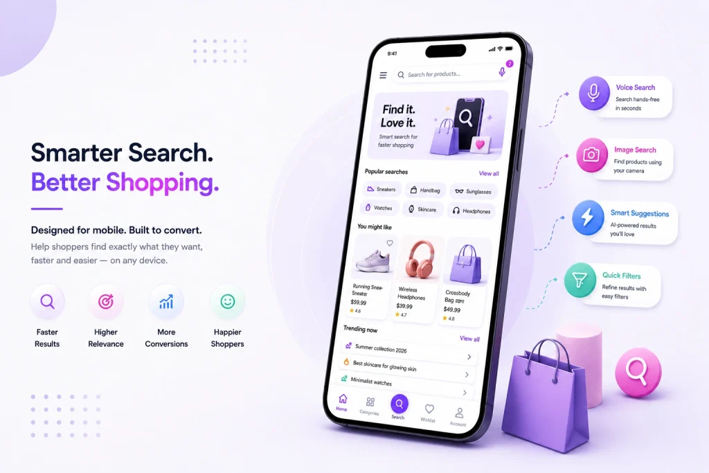
This guide covers how mobile ecommerce search differs, what great mobile search looks like, and nine proven wins for 2026.

What Is Ecommerce Search UX?

Ecommerce search UX is the design of every touchpoint in the search journey—from discovering the search bar to finding the right product with confidence.
Mobile ecommerce search is onsite product search designed for smartphones and tablets — the search bar, autocomplete, results, filters, and alternative input modes (voice, camera) that mobile shoppers use to find products. It shares its engine with desktop search but demands different design: thumb-friendly controls, aggressive autocomplete to minimize typing, results that communicate in less space, filters that work in overlays rather than sidebars, and speed budgets measured in milliseconds because mobile shoppers abandon slow experiences fastest.

Mobile search shares the same engine as desktop, but requires an entirely different user experience focused on speed, touch interaction, and minimal typing.

Done well, mobile ecommerce search feels effortless; done poorly, it’s the biggest single conversion leak on the device where most of your traffic lives.

Search Journey

👆

Touch Friendly

Large thumb-friendly controls

Autocomplete

Reduce typing instantly

📂

Overlay Filters

Designed for small screens

🎤

Voice Search

Alternative input method

Why Mobile Ecommerce Search Matters

Mobile search directly influences conversion because it sits at the center of the shopping journey. Every interaction either removes friction or creates it.

Mobile Dominates Traffic

Mobile drives the majority of ecommerce traffic for most retailers, making mobile search one of the most important customer touchpoints.

Search Converts Better

Mobile shoppers who search convert at a multiple of shoppers who browse, yet mobile conversion still trails desktop because of experience gaps.

Every Interaction Matters

Typing on glass is slow and error-prone. Every keystroke saved, typo corrected, and irrelevant result avoided has an outsized impact on mobile shoppers.

Highest ROI Opportunity

Improving mobile search is one of the highest-leverage conversion projects available. The traffic already exists—the experience simply has to stop losing it.

How Mobile Search Behavior Differs

Mobile shoppers behave differently, and design has to follow.
Shorter, Messier Queries
Typing on a phone produces shorter queries with more typos. Typo tolerance and smart query understanding matter more than on desktop.
Heavier Reliance on Autocomplete
Mobile shoppers tap suggestions rather than finish typing. Autocomplete quality effectively is the search experience on mobile.
Fewer Visible Results
A phone screen shows two to four products. Ranking precision matters far more — position one through four is the whole game.
More Voice and Camera Input
Phones make voice and visual search natural. Shoppers speak queries and snap photos when typing is inconvenient.
Context on the Go
Mobile sessions happen in moments — commutes, store aisles, couches. Sessions are shorter and more interruptible, so getting to the right product fast is everything.

9 Proven Wins for Mobile Ecommerce Search

Win

Why it works

Prominent, sticky search bar
Mobile search users convert at multiples of browsers
Aggressive smart autocomplete
Every saved keystroke lifts completion rates
Built-in typo tolerance
Thumb typing guarantees misspellings
Ranking precision in top 4
That’s all a phone screen shows
Overlay filters that work
Faceted refinement without losing context
Voice search input
Faster than typing in hands-busy moments
Camera / visual search
Snap-to-shop fits mobile behavior natively
Sub-second response times
Mobile shoppers abandon slow search fastest
Mobile-segmented analytics
Mobile failures differ from desktop — measure them apart

Designing the Mobile Search Experience

A great mobile search experience removes friction before shoppers notice it. Every interaction should reduce effort, increase speed, and help shoppers reach products with fewer taps.

Make Search Impossible to Miss

Keep the search bar visible when the page loads and sticky while scrolling so shoppers can search at any moment without hunting for the feature.

Use Rich Autocomplete

Show product thumbnails, pricing, and suggestions instead of plain text so shoppers can jump directly to products.

Optimize Filters

Present filters inside a bottom-sheet overlay and display active filter chips so shoppers always understand the current results.

Start With a Full-Screen Search

Open a dedicated search screen containing recent searches, trending products, and popular categories before shoppers type their first character.

Keep Results Easy to Scan

Large product images, clear pricing, concise titles, and generous spacing make browsing comfortable on small screens.

Promote Alternative Inputs

Place voice, camera icons directly inside the search bar so shoppers naturally discover them whenever typing feels inconvenient.

🔍 Visible Search → 🖼️ Rich Suggestions → 📱 Scannable Results → 🎤 Voice & Camera

Speed: The Silent Mobile Conversion Factor

Mobile shoppers expect instant responses. Every millisecond saved throughout the search journey directly improves engagement, satisfaction, and conversion.

Keystroke

Every character typed should trigger autocomplete suggestions almost instantly to keep shoppers engaged.

Instant Suggestions

Fast autocomplete minimizes typing effort and helps shoppers reach products before they finish typing.

Search Results

Query-to-results latency should remain well under one second, even on real mobile networks.

Image Loading

Product thumbnails must appear immediately because visual feedback keeps shoppers browsing.

Filters

Applying filters should update results instantly without interrupting the shopping journey.

<200ms

Target Response

Real Devices. Real Networks.

Test mobile search on an actual smartphone using a real cellular connection—not office Wi-Fi. Modern AI search platforms achieve sub-second, often sub-200ms response times through edge delivery and efficient retrieval, producing a measurable improvement in mobile conversion.

Common Ecommerce Search UX Mistakes

Small UX decisions can quietly reduce conversions. The most common search UX mistakes are surprisingly consistent—and completely avoidable.

❌ Common Mistakes

Search hidden inside the hamburger menu.
Desktop autocomplete used without mobile optimization.
No typo tolerance for thumb typing.
Filters require pinching or horizontal scrolling.
Slow response times on real mobile devices.
Desktop and mobile analytics reported together.

✅ Better Approach

Keep search visible on every page.
Use thumbnail autocomplete with large touch targets.
Support typo correction and predictive search.
Design full-screen mobile filter drawers.
Deliver sub-second search performance.
Track mobile search metrics separately.

Measuring Mobile Search Performance

Mobile search directly influences conversion because it sits at the center of the shopping journey. Every interaction either removes friction or creates it.

Mobile Web

Search Usage Rate

Measure how many mobile visitors actively use search.

Search Conversion

Track purchases completed after a mobile search.

Zero Results

Identify searches that return no products.

Optimization Signals

Autocomplete Usage

Percentage of searches completed through suggestions.

Voice & Camera

Track adoption of alternative search inputs.

Real Device Speed

Monitor response times using actual mobile devices.

📊 Measure → 🔍 Analyze → ⚙ Optimize → 📈 Re-measure

Mobile Ecommerce Search in Apps vs. Mobile Web

One intelligent search engine can power both mobile web and native applications while delivering experiences optimized for each platform.

🏬

Mobile Web

Mobile web reaches every shopper instantly through the browser, making it the broadest entry point for ecommerce search.

🔍

One Search Engine

Shared API

🛒

Native App

Native apps deliver faster interactions and deeper integration for your most loyal shoppers.

API-First Architecture

Mobile web and native applications consume the same search API, ensuring identical relevance, personalization, and merchandising while allowing each platform to deliver a user experience optimized for its own strengths.

Mobile Ecommerce Search and In-Store Moments

Some of the highest-intent shoppers are already standing inside your store. Mobile search should help them complete their purchase—not send them somewhere else.

🏬

In the Store

Shoppers compare prices, read reviews, check product specifications, and look for unavailable sizes while standing in the aisle, making every second of the search experience critical.

🔍

Mobile Search

📷 Camera Search
📦 Barcode Lookup
📍 Local Inventory
⚡ Instant Answers

🛒

Purchase

Fast and accurate mobile search removes hesitation, helping shoppers confidently purchase in-store, reserve items for pickup, or complete the order online within seconds.

Ecommerce Search UX for Different Shopper Modes

Great ecommerce search UX adapts to different shopping behaviors. One search bar serves multiple shopper modes by recognizing intent and responding with the right experience.

Measure Everything

Instrument mobile separately and baseline every metric so every improvement can be measured accurately.

Improve Visibility & Speed

Add a prominent sticky search bar and achieve sub-second responses on real mobile devices.

Upgrade Search Input

Implement thumbnail autocomplete, typo tolerance, and visible voice and camera search icons.

Optimize & Test

Fix the top failing mobile queries and A/B test the results grid to improve mobile search conversion.

bCloud AI is built for mobile-first discovery. Its NeuralSearch delivers sub-second responses with semantic understanding that rescues short, messy mobile queries; typo tolerance and smart autocomplete are native; and voice, camera, and conversational input all run on the same engine, so a shopper can type, speak, or snap and get consistent results. Real-time personalization makes the few visible results the right ones per shopper, and analytics segment mobile performance out of the box. Because it’s API-first, the same capabilities power responsive web, PWAs, and native apps — see our headless commerce search guide for the architecture. To compare platforms, see the best ecommerce search engines for 2026.

Frequently asked questions

What is mobile ecommerce search?
Mobile ecommerce search is onsite product search designed for smartphones and tablets — the search bar, autocomplete, results, filters, and alternative inputs like voice and camera that mobile shoppers use. It shares an engine with desktop but demands mobile-specific design for input, space, and speed.
Mobile drives the majority of ecommerce traffic for most retailers, and mobile shoppers who search convert at a multiple of those who browse — yet mobile conversion still lags desktop. Fixing mobile search closes that gap using traffic you already have.
Mobile queries are shorter and messier, shoppers rely heavily on autocomplete, screens show only two to four results, voice and camera input are natural, and sessions are shorter and more interruptible. Design and ranking must adapt to all five differences.
Make the search bar prominent and sticky, invest in rich autocomplete with thumbnails, enable typo tolerance, perfect the top four results, move filters into usable overlays, add voice and camera input, hit sub-second speed on real devices, and measure mobile as its own segment.
Critical. Mobile networks are variable and attention is short, so latency directly drives abandonment. Test autocomplete and results speed on a real phone over cellular; modern AI platforms deliver sub-second and often sub-200ms responses, and the difference shows in conversion.
Yes. Typing on glass is slow, so voice and visual search fit mobile behavior natively. Make both discoverable as icons in the search bar itself, and run them on the same engine as text search so results stay consistent.
Separately from desktop. Track mobile search usage, conversion, zero-results rate, autocomplete engagement, voice/camera adoption, and speed percentiles on real devices — then compare against desktop to find the gaps and work them down.
The best platform combines sub-second speed, semantic understanding for short messy queries, native typo tolerance, rich autocomplete, voice and visual input on one engine, personalization, and mobile-segmented analytics. Leading AI-native options include bCloud AI.

Win the Screen Where Your Shoppers Actually Are

See mobile-first AI search — text, voice, and camera — on your catalog.
Scroll to Top